
I mentioned that I would say a few things about Mann’s hockey stick graph. For those of you who don’t know it, here it is:
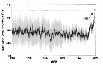
I’m using the version from Mann et al, 1999, which you can find here. The paper draws on a dataset in the earlier paper, Mann et al, 1998, which you may find here.
This is going to get a little bit complex, but here’s the short version: this graph is a load of junk.
Now, at this point, a whole number of objections will come up. How can stuff published in Nature and Geophysics Research Letters be a “load of junk”? And anyway, wasn’t this investigated and found to be A-OK?
Not exactly. Turning to that noted frothing, denialist publication Nature for a few seconds, and their coverage of the findings. Here is what they say:
“We roughly agree with the substance of their findings,” says Gerald North, the committee’s chair and a climate scientist at Texas A&M University in College Station. In particular, he says, the committee has a “high level of confidence” that the second half of the twentieth century was warmer than any other period in the past four centuries. But, he adds, claims for the earlier period covered by the study, from AD 900 to 1600, are less certain. This earlier period is particularly important because global-warming sceptics claim that the current warming trend is a rebound from a ‘little ice age’ around 1600. Overall, the committee thought the temperature reconstructions from that era had only a two-to-one chance of being right.
Pay very careful attention to those two lines. A part of Mann’s claim to faim is his line that:
“the 1990s are likely the warmest decade, and 1998 the warmest year, in at least a millennium”.
On a straight reading of this, the finding says, “Well, maybe. I’ll give you two-to-one odds”.
So, given that this is so uncertain, should Mann be waving his hockey stick around quite so much? No, says the committee:
Panel members were less sanguine, however, about whether the original work should have loomed so large in the executive summary of the IPCC’s 2001 report. “The IPCC used it as a visual prominently in the report,” says Kurt Cuffey, a panel member and geographer at the University of California, Berkeley. “I think that sent a very misleading message about how resolved this part of the scientific research was.”
“No individual paper tells the whole story,” agrees North. “It’s very dangerous to pull one fresh paper out from the literature.
Know who else agrees? Mann:
Mann says that he is “very happy” with the committee’s findings, and agrees with the core assertion that more must be done to reduce uncertainties in earlier periods. “We have very little long-term information on the Southern Hemisphere and large parts of the ocean,
“Very little long-term information on the Southern Hemisphere”? That’s half the planet.
Wait a second. If this is okay, why was the graph “cleared”? Well, the graph wasn’t. The finding wasn’t that this graph is accurate, it is that Mann is innocent of scientific fraud. That’s a very important distinction. There is no shame, none, in science in being wrong, or merely being incomplete. Here is Peter Bloomfield on it:
“This study was the first of its kind, and they had to make choices at various stages about how the data were processed,” he says, adding that he “would not be embarrassed” to have been involved in the work.
Exactly. Mann did us all a service by pioneering this kind of research. It is completely unsurprising that a model over a decade old has been superseded. It’s no shame whatsoever; in my own field, forty years of research got turned on its head because it was found – seriously – that the original experiment on which so much of it was based had not included enough salt. You can read the whole story here. Despite chasing a phantom, those forty years produced excellent results in the field of DNA-protein association kinetics, and the founder is still honoured. Mann could have gone down the same way; someone who pioneered a tough new method of looking at global temperature.
But no. He just had to go and get involved in the political circus.
Now, back to this graph, why do I say it’s a “load of junk”? That’s quasi-facetious; it’s a decent if highly flawed use of a good technique and the time that has since been superseded.
Remember that bit about the earlier times being uncertain? Well, one of the big criticisms of it can be seen in the following (from previously linked Nature article):
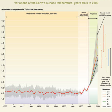
It’s a bit difficult to see, but the flat bit (the ‘stick’) is labelled “observations, northern hemisphere, proxy data”, the curving up bit is composed of “global instrumental observations” and “projections”. In other words, there are two different types of measurement going on here.
Think I’m exagerrating? Look at the following:
That’s from a 2003 paper by Mann himself. See that red line? That is, quote “Smoothed instrumental series”, close quote.
Further criticisms is that the proxy data – the stand-ins from tree rings to replace thermometers – do not show the little ice age or the medieval warm period.
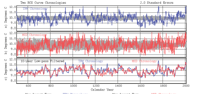
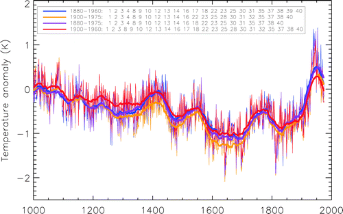
Now the following paper has been making the rounds. The title alone says a lot: “Potential bias in ‘updating’ tree-ring chronologies using regional curve standardisation.” This is a proxy-only temperature reconstruction of global temperatures:
Now my first reaction on seeing this was to shrug and say “So what?” It’s a common mistake by outsiders, but scientific theory is never made by that “one perfect piece of data”. It’s made by hundreds and thousands of pieces of data across a huge range that all point to the same conclusion. That’s why one paper alone means little (it’s also why Mann’s original paper should never have been oversold), and why I go by the IPCC. So I started to look for criticisms of this one.
I found something else.
I found this paper, which contains (p 18- 25) a whole raft of proxy temperature reconstructions which look very different depending on how they are chosen. It’s journal has an impact factor of 1.109 (not great, but still)…
And then this one, which gives me this graph:
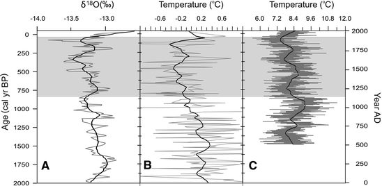
(impact factor: 1.898)
And then there’s this one:
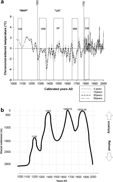
Impact factor: 3.973 (quite healthy).
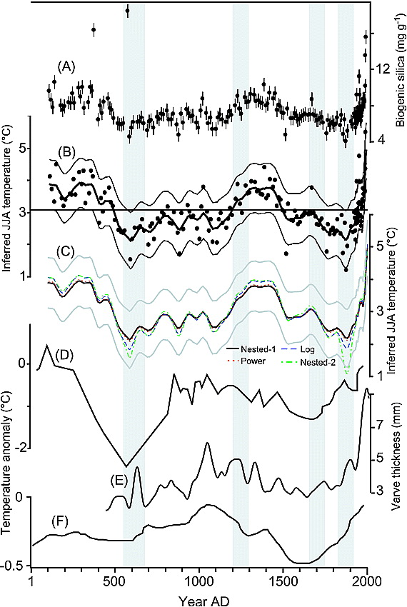
And then there’s this one, where even the physical readings are being questioned.
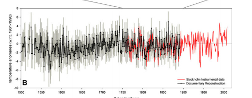
(Impact factor: 3.385)And then there’s this beauty, containing a stack of proxy data.
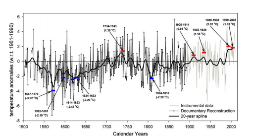
(Impact factor: 4.097)Note that this still shows warming, but it is substantially different from the Mann graph.
And then there’s this one
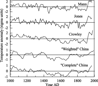
Comparing the temperature record for China with Mann’s original work,
And this:

Using grape harvesting dates as a proxy.
And finally,
These last three are all from Geophysical Research Letters, with an impact factor of 3.505, one of the great journals of climate science.
I also found the following analysis of the maths behind it, which had the following sentence in’t:
This creates a cold bias in the reconstructed record and makes it impossible to make any statements about how warm recent decades are compared to historical periods
(Impact factor: 3.385)
I’m sure that’s overstating it, it’s certainly something to bear in mind when you review all these proxy reconstructions.
What strikes me about all this is that I didn’t go looking for these graphs, quite the opposite. They were, quite literally, the first papers I stumbled across when I was looking for a critique of the other one. As I said, one piece of data or a graph does not mean anything, but it’s the sheer number of these I found makes me wonder how many others are out there.
Note that many of these show a good bit of warming, though not the same as the original graph. I repeat my position, because I can guess the kinds of accusations that will come flying: global warming is real, manmade, and a problem.
This is what science actually looks like, rather than what the cartoon version of it is. That is one reason why I rely on the IPCC for my data. It is also why science and politics should be kept separate; the careful, admit-you-were-wrong, time-to-improve mode of thinking is largely incompatible with the bigmouth political circus.