
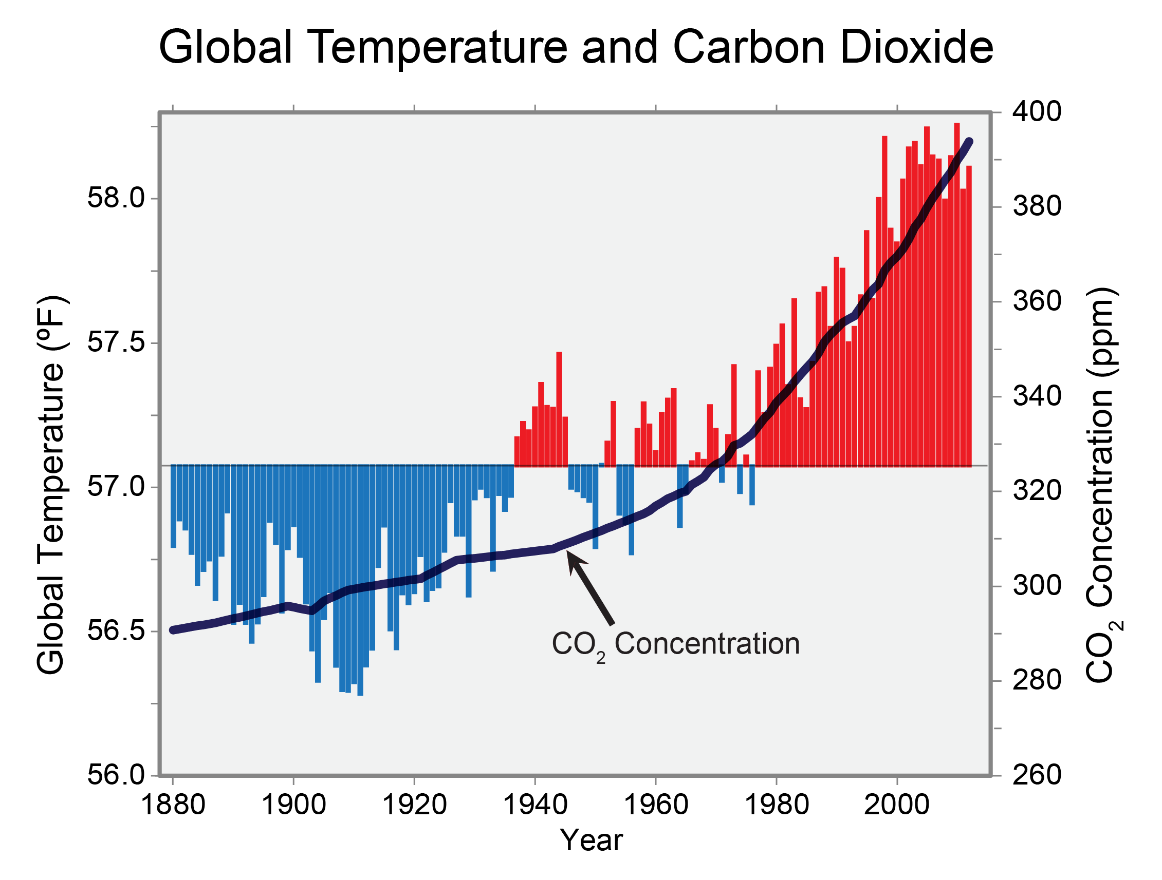
If you happen to live in a red state or have lots of conservative relatives, you are probably going to run into some hardcore science denialism on the topic of anthropogenic climate change from time to time. Next time this happens, I would suggest having a look at (and a chat about) the mostly lovely and only slightly deceptive data visualizations up at www.GlobalChange.gov.
Here they are: http://nca2014.globalchange.gov/highlights/report-findings/our-changing-climate
They game the y-axes a bit much for my tastes, but overall these are useful to know about.
Share and enjoy!